Creating a report with a custom shapefile in Cubeware Cockpit
Earlier I described how to create the custom shapefile. Now I show you how to create some sample data for the report. Now let’s create a report based on that shapefile.
You can grab my shapefile here if you didn’t create your own.
First of all we need some sample data. Take the following script to create a database with the relevant data. The script should be compatible with at least SQL Server 2008 (nothing special there). If you are running another database than SQL Server it shouldn’t be too difficult to adapt it to the SQL dialect of your product.
For the sake of simplicity we’ll work with this relational database. A cube would have been a viable option but seemed a bit like overkill to me.
Now open up Cubeware Cockpit and add the newly created database to your repository as a relational database using the database manager (<Ctrl> + <D> will open it). This shouldn’t be too complicated therefore I won’t describe that process.
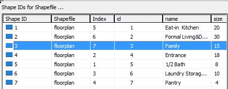
Then go to the Shape Manager (Menu Repository->Shape Manager) in order to add your custom shapefile. Import the shapefile using Menu Shapes -> Import Shape File. Select the floorplan.shp file created from your QGis Project (you can also get it here).
Now your shape manager should look like the following picture:

Next, create a shape set for the usage of your custom shape file in a report. Shapesets can group multiple shapefiles. Click on the folder “Shape Sets” and choose “New shape set” either from the context menu or the menu Shapes. Give it a name and add the shape floorplan. Before getting started with the report we now have to do some editing of our shapeset.
Select all rows and choose “populate shape id from this column” using the id column. Afterwards edit the shape ids to remove the blanks. This is a very important step as otherwise the shape set couldn’t be linked to our report.

Now your shape set configuration should look like this:
Initial report creation
That’s all for shape configuration. Now we’ll create the report and put our shape set into action.
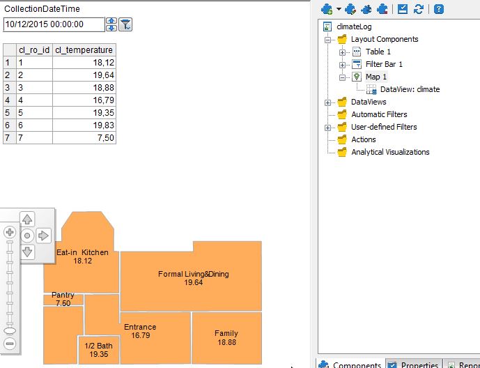
Create a new relational report using the New button (<Ctrl> + <N>). Point the connection to the relational database you set up at the beginning of this tutorial. Provide this simple query to retrieve the room temperatures for a given point in time.
SELECT

     CAST(cl_ro_id AS varchar(3)) AS cl_ro_id,

     cl_temperature

FROM

     dbo.climateLog

WHERE

     cl_collectionDateTime = '20151016 09:00'
Finish the report creation wizard. You might now be asked to provide your login data. Proceed and save these. Your report should now look like this:

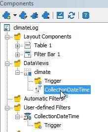
Adding a filter on CollectionDateTime
Let’s then add some usability…a filter on the collectionDateTime to make the report more dynamic. Create a new user-defined filter (by opening the “Components View “ and right clicking on “User-defined Filters” and choosing “New user defined filter”). Choose a Query-based Filter. Then provide the following query for the filter values:
SELECT DISTINCT

cl_collectionDateTime

FROM

dbo.climateLog

ORDER BY

cl_collectionDateTime
Skip the pages “Column Assignment” and “Properties” and eventually name your filter “CollectionDateTime”. Then add a new filter bar (via “Components” and right clicking on “Layout Components” and choosing “New Layout Component”). Choose a filter bar, click next and assign the “CollectionDateTime” Filter you’ve just created. Insert the filter bar at the top of the page and click “Finish”. Your report now looks like this….you should be able to select different values in the filter bar…however they don’t have any effect on the data show (yet).
To bind the filter selection to your query go back into the data view (Menu “Report” -> “Data View Designer”). Select the date part of the query and click on the “Add parameter” icon.

Configure the parameter according to the following screenshot.

Then select the filter in the components view and drop it onto the parameter (visible beneath the data view).
The pop up window “Transformation Rule” can be skipped with “OK” (transformation should be “element”). Now your data should change as you select different collection times.
Put your shapeset into action
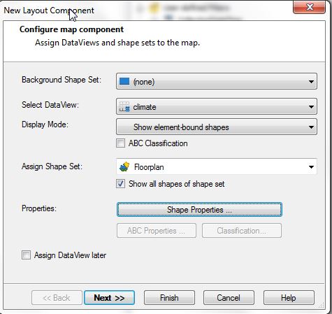
Add a new layout component to your report (via “Components” and right clicking on “Layout Components” and choosing “New Layout Component”). Choose the layout component type Map and click “Next”. Configure the map component like in the following screenshot. Then click on “Shape properties” and configure the fill style to “Solid shading” and Color 1 to a color you like. This will be used as a test to determine, if the linkage between shape set and data view works properly. Activate element values and shape attributes (just “name”) as well.

Then click finish. Now your shapeset should be included in your report and every room should be colored in the color you selected before. You can also see the temperature values already.
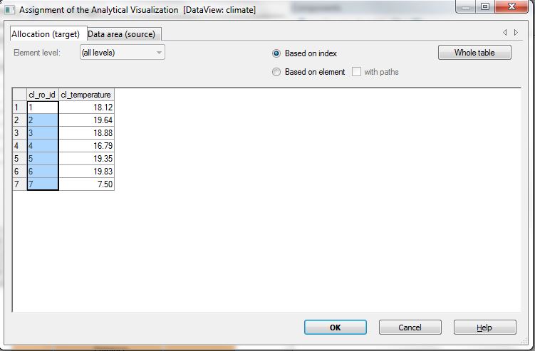
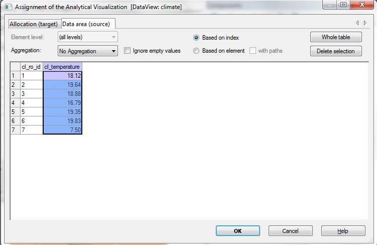
Then add a new analytical visualization (via “Components” and right clicking on “Analytical visualizations” and choosing “New Analytical Visualization”). Choose type Gradient and click on next. Set the column cl_ro_id as allocation target and the second column cl_temperature as data area (source). After leaving the allocation dialogue you should see “column 1” as allocation(target) and “column 2” as Data Range (source).
Click next and configure the colors like in the following screenshot:

Then finish creating the gradient analysis. Next select it in the Components view and drop it onto the Map component. Repeat the assignment of columns (target cl_ro_id, source cl_temperature) and enjoy your color graded maps as it changes while filtering on different collectionDateTimes.

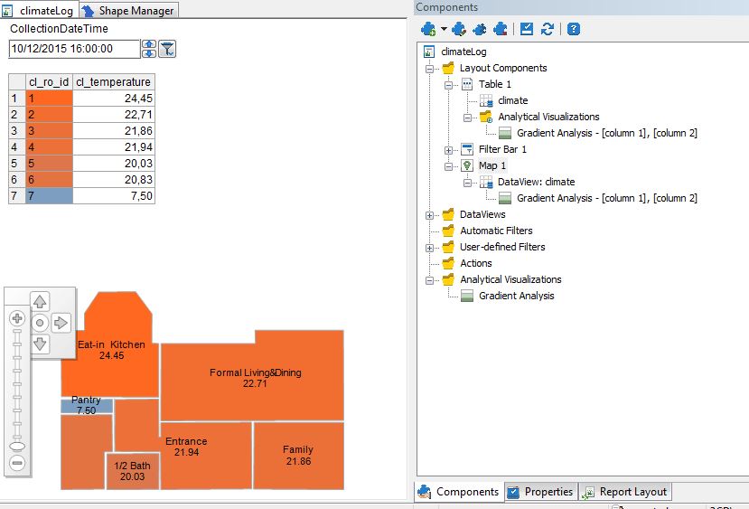
Finally you could do some cleanup removing the (now useless) table. Switch to the “Report Layout” pane (Menu “Report” -> “Report Layout Window”) , select table 1 and drop it into the unused layout components box. Of course you could delete the table, however I found it useful to have it around for testing new developments.
