Better leave pies for dessert
Example of an odd data viz
I recently received mail with the following dataviz that made me chuckle and think:
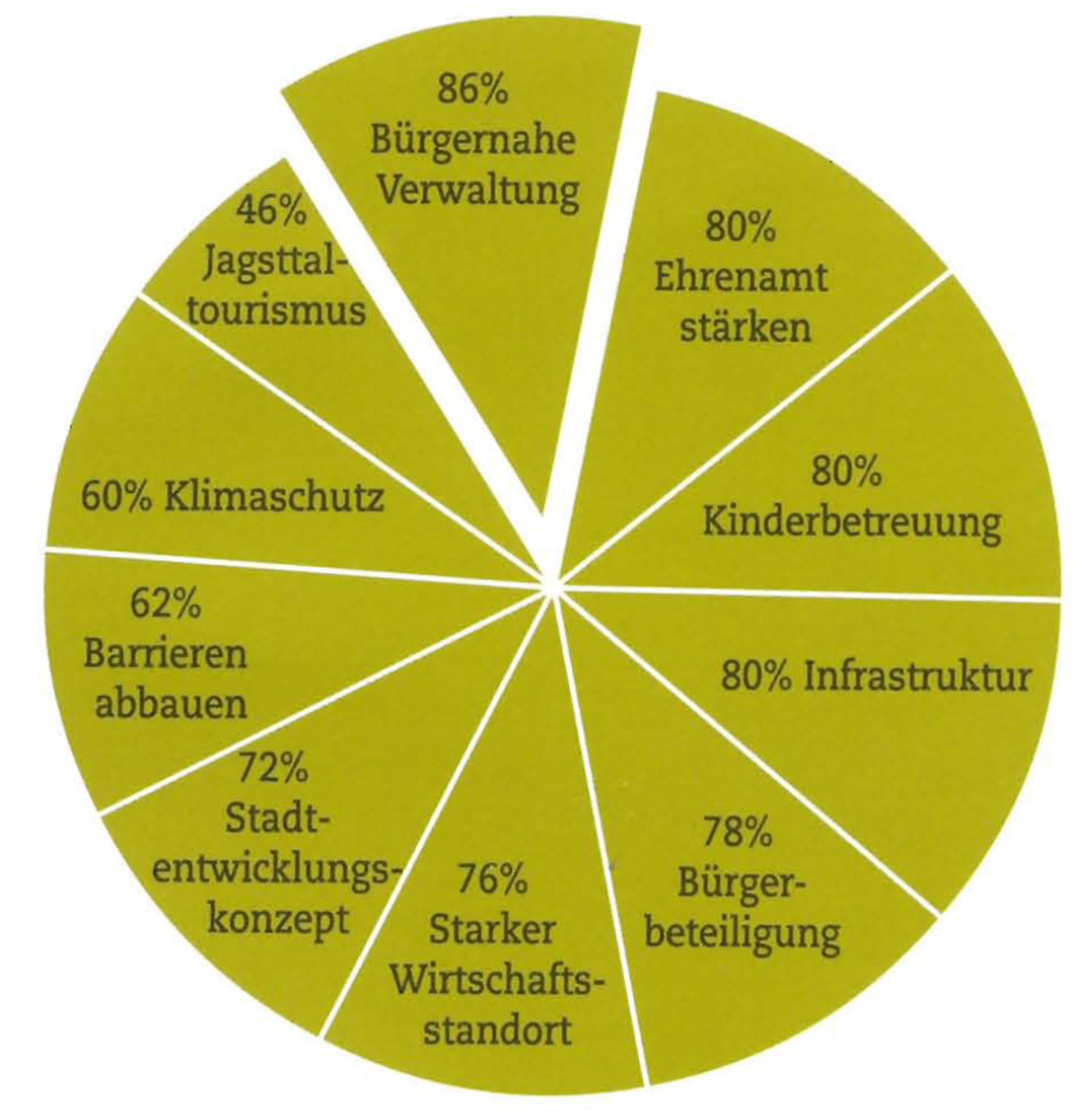
You might think, what the heck is that all about? In my home town an election for a new mayor will happen soon. One of the candidates asked all voters what they consider to be important from predefined categories. One important detail is, that you naturally could pick multiple answers. Just have a look at the percentages and ask yourself what is odd with this data viz?
Clear answer is: They don’t add up to 100%. If we use a pie chart for data viz we always visualize a proportion of the total and naturally expect it to add up to 100%…however here we have a total of 720%.
There are other reasons why pie chart often are not an ideal candidate for data viz nicely covered here and here. The IBCS standard (rule EX 2.1) also suggests to replace pie charts with other more appropriate chart types.
Alternative vizualizations
I suppose the pie has been chosen because it just “looks nice”. However oftentimes a bar chart is way more effective to convey the message than the pie.
Bar Charts are your friend
This is how I would have visualized the results…I took the liberty to translate the topics to English.
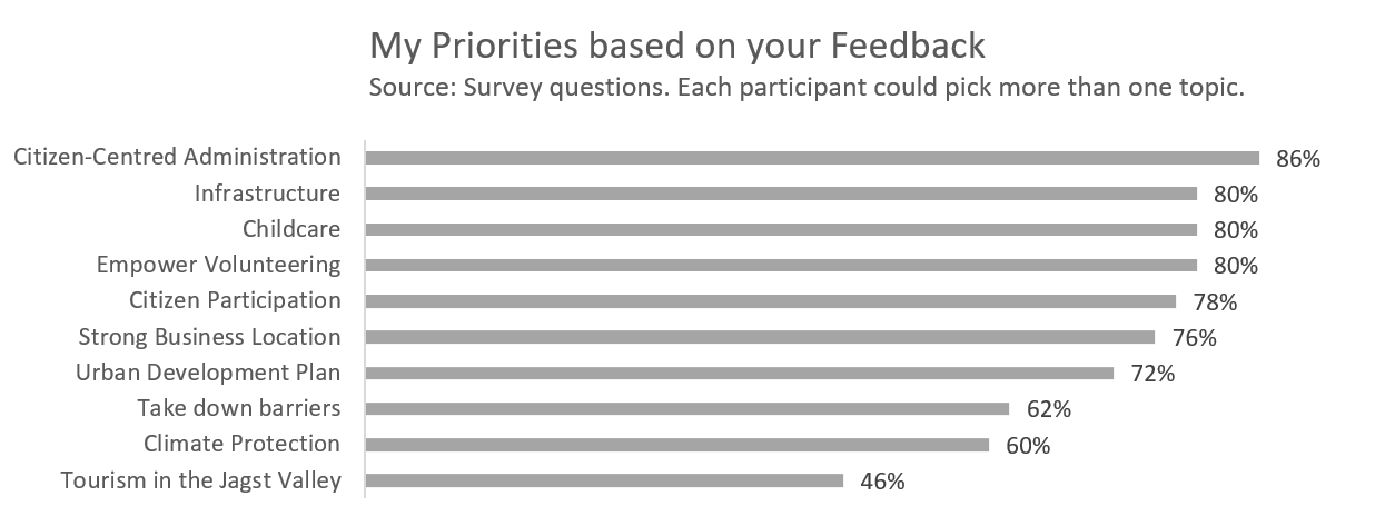
Based on this chart one can quickly tell that 4 out of 10 topics were important for more the 80% of the respondents. The last three topics don’t seem to be that popular.
Fun Fact: I used Excel 2013 to do the quick data viz. Even this old version already had a feature called “recommended diagrams” which does recommend exactly this bar chart (formatting details put aside 😉).
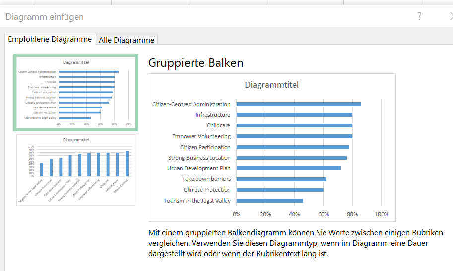
It also suggests a column chart which is however not that ideal for categories and should only be used for comparing values over time (refer to IBCS rule EX 1.1 when in doubt).
Must have a pie chart? Go for small multiples
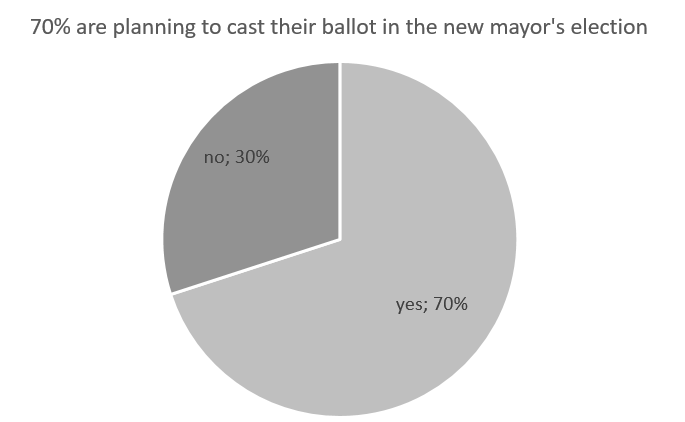
There is one kind of pie chart which actually does work but often is overlooked: The pie chart with exactly 2 categories.
Here’s an example with fictious figures:
We can leverage this principle with small multiples:

These pies work beautifully as each pie adds up to 100 % and even without reading the numbers you can quickly get the impression which topics are most relevant based on the survey. This is how the pie works for us: We can quickly determine if one slice is quarter, half, three-quarter or respectively more or less than that. Nonetheless the bar chart will be my first choice as it allows for more information density.
What’s missing?
Having looked at the numbers for quite some time now one important figure is missing: How many people received the invitation to take part in the survey and how many actually responded. Figures often tend to be read as “this is the truth” however this depends very much on the number of answers and in this case the diversity of the respondents. Of course it would be a bit too much to start a formal representative survey however publishing the numbers would be one important sign to more transparency.
Now what?
So what does this mean to me personally? It’s a clear evidence, that a lot of people still struggle with information design. That’s no big surprise as this topic is something the education in school doesn’t seem to put much emphasis on. Reflecting my own school history I had a module called “Schaubildbeschreibung” (chart description) in German. There we deciphered one pie or nice looking infographic after another and I logically came out of this class with the impression: This is the way to visualize.
Will it have any effect on my vote?
Honestly no. I guess the candidate didn’t chose that visualization himself. And even if he did…a mayor has more important tasks to look after than creating charts 😀. I definitely don’t want to put the candidate on the spot here and therefore don’t share his or her name. This blog post is rather about raising awareness on good information design.