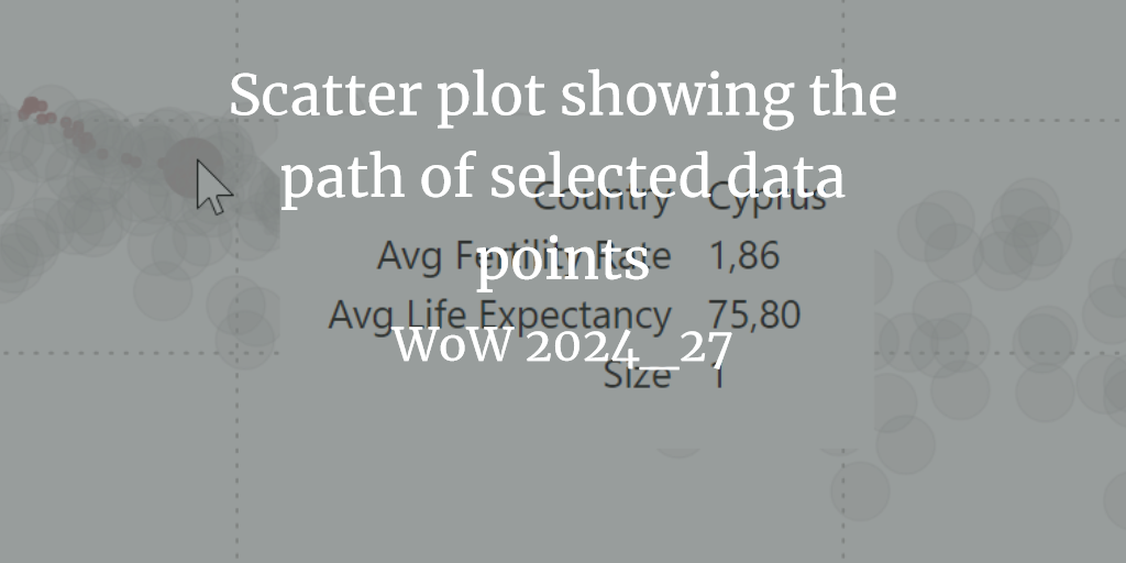
Browsed by
Category: data visualization

Better leave pies for dessert

Better leave pies for dessert

Example of an odd data viz I recently received mail with the following dataviz that made me chuckle and think: You might think, what the heck is that all about? In my home town an election for a new mayor will happen soon. One of the candidates asked all voters what they consider to be important from predefined categories. One important detail is, that you naturally could pick multiple answers. Just have a look at the percentages and ask yourself…

Read More Read More

Pass Summit 2019: Conference Day 2

Pass Summit 2019: Conference Day 2

I already did a quite extensive write-up on some sessions from Conference Day 2 at PASS Summit 2019. Cybersecurity is everyone’s problem: An extract from the Keynote of Day 2 at Pass Summit Survival Techniques for the lone DBA (Pass Summit 2019 Conference Day 2) Successfully communicating with your customers (Pass Summit 2019: Conference Day 2) Here I would like to share the remaining sessions I went to. Design Strategies and Advanced Data Visualization This was quite an interesting session…

Read More Read More

A matter of data visualization

A matter of data visualization

Some time ago my boss asked me for advice on a report he just created. Here’s an example with sample data of what he liked to visualize: For different dates we have a count of objects which had a specific final status. You can reproduce the sample data using the following select statement: query-with-inline-sample-data Goal of the visualization should be to show the distribution across the different status and the overall development of the measured data. Our first approach was…

Read More Read More